 Can you design your vintage wedding theme around a Pantone color named “Tangerine Tango”? Absolutely, you can. And should, if your tastes run to orange colors for your wedding. The trick to incorporating the Pantone colors into your vintage theme is mixing them in a way that allows some colors to pop, while others are subdued.
The Spring/Summer 2012 PANTONE Color Report is a combination of bright, bold colors and soft, almost misty hues. Cabaret is a bold pink, while Sweet Lilac is a barely-there soft purple. Starfish is sandy, a perfect complement to Cockatoo’s teal blue, or Margarita’s seafoam green. The advantage of using the Pantone fashion color report as a base for your wedding colors is that you don’t have to worry about slight color variations, as long as you supply the correct numbers. Give a vendor Pantone color 13-0759 and whatever item you order will be the same golden yellow Pantone calls Solar Power whether you order a shirt, a wall color, or a bridesmaid’s dress. It takes the guess-work out of color matching for your vintage wedding theme.
So, how to incorporate the newest Pantone colors into a vintage wedding theme?
Decorations
Your chosen vintage era for your vintage wedding theme may have an impact on how you use your colors. For a Victorian vintage theme, you might want to center one bright color–say, Tangerine Tango–and surround that with with pearls and lace in a cream color mixed with Pantone’s Starfish. For your table, a cream and Starfish table runner lined with floral arrangements in your chosen colors will bring your vintage-style atmosphere right to the fore.
If, on the other hand, your vintage era is the Art Deco period, you will want to play up other Pantone colors entirely. Keep the Tangerine Tango and instead of subduing the color, embrace its brightness. Pair it with Pantone’s teal, Cockatoo, and the golden yellow, Solar Power; with your geometric decorations, you can recreate that time when innovate art and design were at their heights.
Some floral items that pick up on the Pantone fashion color report choices are:
Tangerine Tango – Orange dahlia, Orange Gerbera daisy, Orange Parrot tulip.
Starfish – Scabiosa pods, balsa wood
Invitations
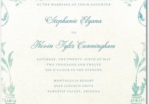
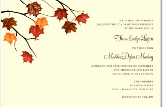
Your invitations, Save the Date cards and the like are often the first thing guests see of your wedding. You can make your vintage wedding invitations memorable by choosing your colors from the Pantone color chart and creating your invitations around them.
Both Starfish and Driftwood, despite their names, are elegant, rich hues. A deep grey, used correctly as either a base tone or accent color, Driftwood can exude class. A Driftwood invitation, accented with old lace and pearls is sure to get noticed.
Starfish is neither brown nor grey, but exists in some color palette in between the two. Combine it with an old-lace ribbon and add a pop of color with a small Tangerine Tango and its very simplicity allows your vintage wedding invitation to stand out.
There are, of course, no hard and fast rules to using the Spring/Summer 2012 PANTONE Color Report as the basis for your vintage wedding theme. Take the colors that appeal to you and combine them in a way that brings old times to mind. A glance through old magazines and photographs (many available online) will give you ideas of which vintage colors and styles will best highlight your vintage theme.





Speak Your Mind